

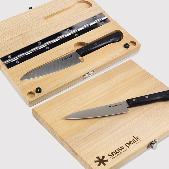

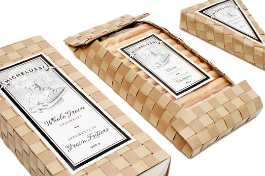

Pietro Gala
Designed by Fresh Chicken | Country: Russia
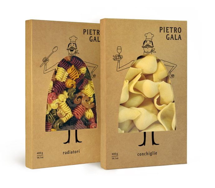
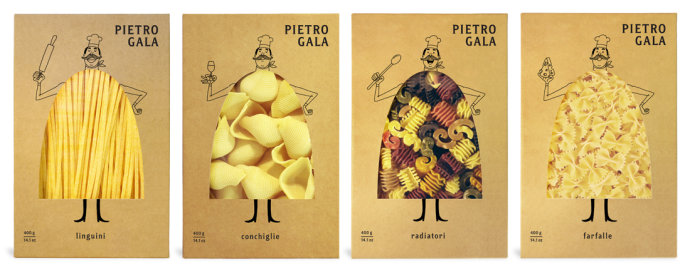
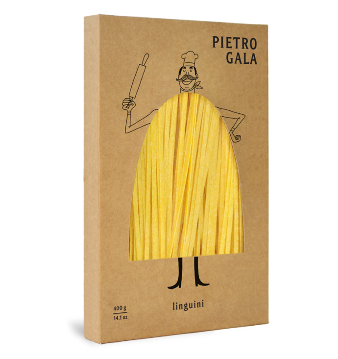
“Pietro Gala” is a new premium pasta brand, distinguished by handcraft manufacturing and high quality ingredients. Fresh chicken agency developed the brand name, character and designed production package. Pietro Gala is an italian chief cook, whose image features different kinds of pasta. Cardboard texture and one-colour print emphasize naturalness of pasta and generate positive emotions.”
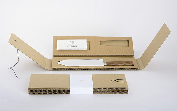
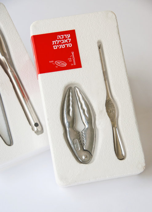
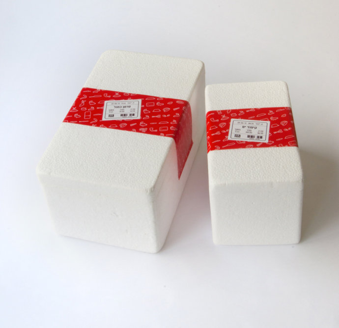
Designed by Ron Keren | Country: Israel
“A concept store specialising in the selling of sea food and guiding the customer through the step by step process; choosing a product from the broad range of exotic raw materials, appropriate handling and storage, through to ideal preparation techniques.
The packaging of the products has been custom designed to ensure that quality and freshness are maintained. Each package is accompanied with a general culinary explanation specific to the product it contains. Visual language techniques were employed throughout the project in the format of sea-food icons. The clean and clear lines provide the customer with an easy and informative pathway to connect with the culinary world under the sea.”
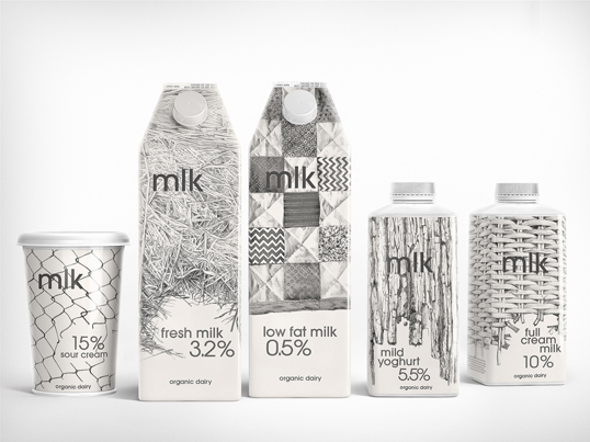
1955年出生于东京,1979年毕业于东京艺术大学设计专业,1981年又从该校研究生毕业,先就职于股份公司电通,1984年成立佐藤卓设计事务所。 从"NIKKA·纯麦芽威士忌"商品开发开始,从事过"乐天·薄荷口香糖系列","乐天·木糖醇口香糖","大正制药·ZENA","明治美味牛奶"等的商品设计;还参与过"BS朝日"、"金泽21世纪美术馆"等的VI设计,是NHK教育"用日语玩耍"的策划成员,从事艺术指导,并且开展着从设计的观点剖析大量产品的"设计的解剖"项目等。

新村则人1960年出生在日本一个只有2000人的小渔村,40多年前没人想到这个小地方居然会诞生一位设计大师。新村则人说,之所以有人称其作品为“生活中的设计”,跟家乡带给他的滋养密不可分。在他的代表作中,包括山口县渔业共同协会的环保海报、家乡新村水产公司的海报等,无不采用生活中俯首可得的素材作为设计主体,海洋、树木、鱼类成为他屡试不爽的绝招,并让他的作品蒙上一层祥和、美好的浪漫色彩。他认为,有些年轻的设计师会苦于没有灵感,其实只要平时注意从身边找到自己喜欢的东西就行了,只要你对其产生热爱,在设计中就会很容易找到契合点,并设计出只属于自己的东西。属于自己的好的创意,往往能填补技法水平不高的劣势。

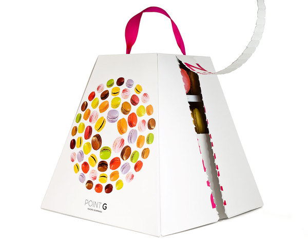
Point G a French word, meaning the G spot… but make no mistake, don't get any ideas, we are talking here about a gourmet spot, the rallying spot of all foodies! Because gastronomy mixes both pleasure and sensuality, it can be shared, offered, discussed… in flavours, colours, images and words. Ode to gastronomical delights in all their forms. With the new packaging platform, you lick (léchez), drink (buvez), crunch (croquez), experiment (expérimentez)… gulp (gobez), spread (tartinez), roll (tirez), pearl (perlez), sear (saisissez), share (partagez), and so on…
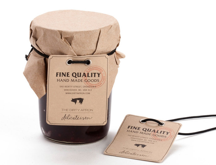
Designed by Glasfurd & Walker | Country: Canada
“The Dirty Apron’s Delicatessen offers hot lunches, gourmet sandwiches, take-home carvery meals, deli meats, local BC Cheeses, fresh flowers, and specialty ingredients and products.
Glasfurd & Walker were commissioned to design all packaging and promotional items for the Delicatessen. From bread bags, shopping bags and tape to gift boxes, lunch boxes and products on the shelves.”
第一眼看上去很可爱,有购买的欲望,对于好的包装来说,这已经够了。
Yummy Tummy Koalas是澳大利亚的一个儿童食品品牌,译为考拉肚子里的美食,品牌共分为3个品类(就是这3只不同名字的小考拉),通过对每只考拉的特点描述,达到对产品的阐述,就好比把产品当做是孩子们自己,比如他们喜欢的美食或是运动什么的,从而带动孩子们一次又一次的购买欲望。以下是对3只考拉的介绍:
米特凯文,刚满八岁,喜欢玩板球,泡泡糖是他的最爱,他认为一天中最艰难的时刻就是睡觉。
布鲁斯,喜欢滑板和吃巧克力,最喜欢粉红色。
凯西,害怕蜘蛛,她最喜欢彩虹的颜色。她的愿望是长大后可以成为一只猫,至少在她生日的时候可以收到一个宠物猫礼物。
谁是凯文,布鲁斯,和凯西?他们就是这3中口味的美食代名词。
当然,最主要的是朗涛通过对品牌包装的设计,帮助品牌实现价值,没有用太多的营销手段,确使销售额在16周里增加了26.2%,成为同等商品里最具竞争力品牌。

bedtime is the worst time of day.
Bruce likes to skateboard and eat chocolate. Hethinks pink is only for girls and shudders at the sight of brussels sprouts.
Cath is terrified of spiders and her favorite color is rainbow. When she grows up she wants to be a cat.
Or at least get a pet cat for her birthday.
Who are Kevin, Bruce, and Cath? They’re not kids—they’re koala-shaped cakes.
Top Taste approached Landor with a simple brief:develop a brand for a snack-sized, koala bear-shaped
mud cake that comes in three flavors. It must bebursting with personality, appeal to kids of all ages,
and stand out from every other snack product inthe supermarket. From this, we created the Yummy Tummy Koalas.
Chocolate, caramel, and white-chocolate flavored cakes became a trio of adorable personalities brought to life through the packaging’s simple and bold illustrations, vivid colors, and fun typography. Kids get to know all about the characters right on the box.
And it doesn’t end there. Each box of Yummy Tummy Koalas was designed for play: Limited edition boxes were filled with stickers for accessorizing the characters. Kevin could look cooler in sunglasses while Cath played netball and Bruce learned to snowboard. The Yummy Tummy Koalas proved so popular, we even made plush toy versions that were
given away as a special promotion.
The result? An irresistible brand that people want to buy again and again. Yummy Tummy Koalas entered the
market in May 2009 and the packaging alone, without any other marketing support, helped the brand achieve
26.2 percent in sales above forecast in the first 16 weeks.
It also grew Top Taste’s share of the competitive snacking cakes segment, which is dominated by private label, by an impressive 1.4 percent.

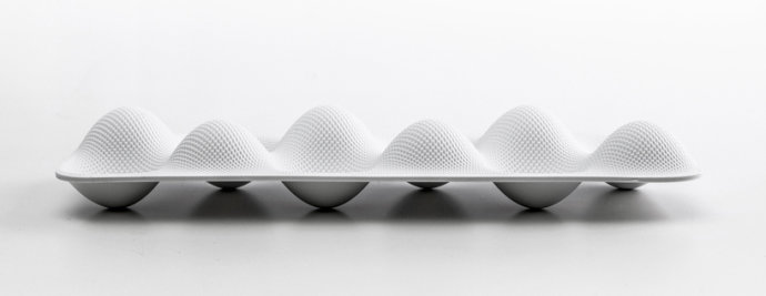
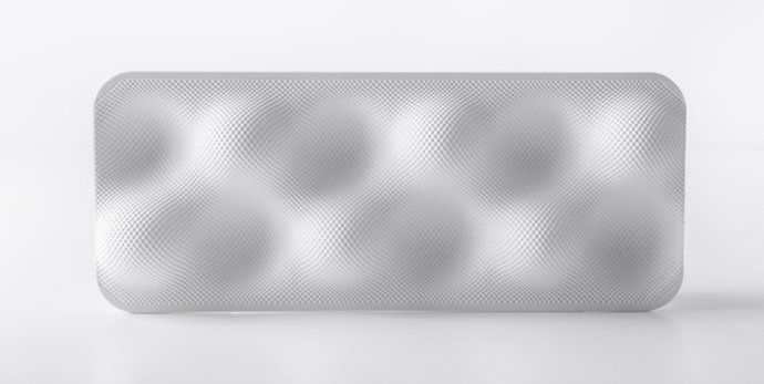
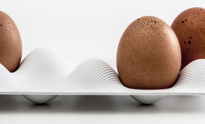
Designed by Otília Erdélyi | Country: Hungary
“My goal was to design an innovative package using a small amount of material. It’s made of natural microwaved carton and consists of one piece. The eggs are placed into ellipse-shaped cuts. The eggs are removed by turning the topside.”

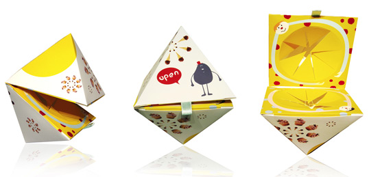
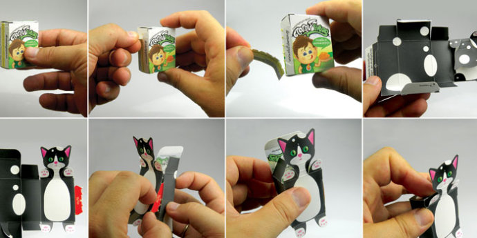
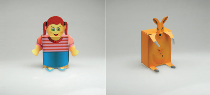
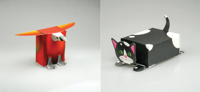
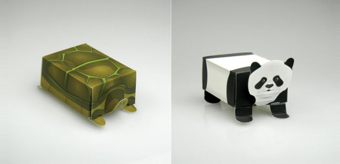
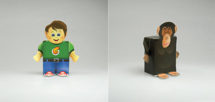
Designed by Matadog Design
This packaging was designed to not only hold the product but to be converted into a kid friendly (no tools or glue needed for assembly) paper toy.
"Package design agency Matadog Design has designed visual identity, structural and packaging for Stafidenios® raisins with innovative packaging for kids that can be converted to paper toy without the use of glue, blade cutter and scissors.
Stafidenios® is a raisins product packed for kids. It is made in Greece and the packaging dimensions specifications are that the product could fit into a kid's cupped hand. Each packaging hide a different paper toy which is a real lure for parents and kids.
What is unique about the packaging is its ability to be used as a paper toy after use with ten different heroes, scrapping the conventional use of scissors, blades and glue which used to be the staple paper toy construction tools, thus making the construction process a cinch for kids as it can be put together in a jiffy while moving around.
It has a minimum packaging disposal, it is extendable with a surprise factor embedded in it and includes collectible paper toys which will be both fun and educational."
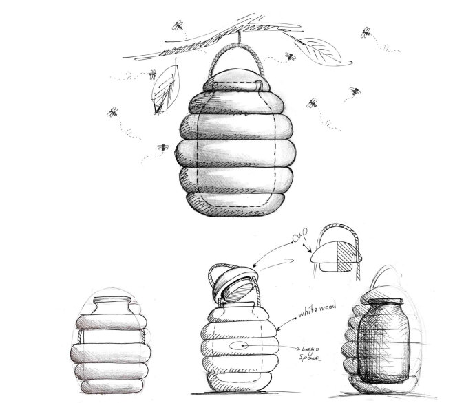
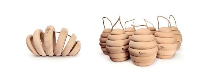
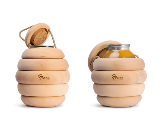
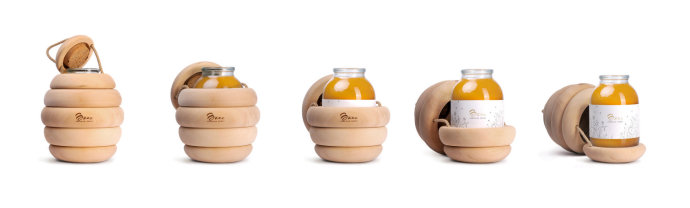
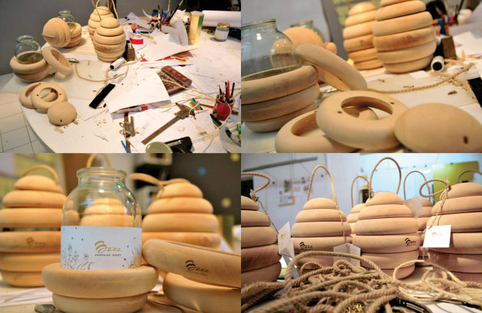
Bzzz Honey
Designed by Backbone Studio | Country: Armenia
“The most tasty honey is in the beehive. But it is impossible to buy it in a market – it was impossible. Designers of Backbone Studio have made it out of wood and hid the can with honey into the improvised beehive. Simple but simultaneously original wooden wrapper is the message to the nature, ecology and pure taste. You immediately want to open and taste it. And there are no bees!”
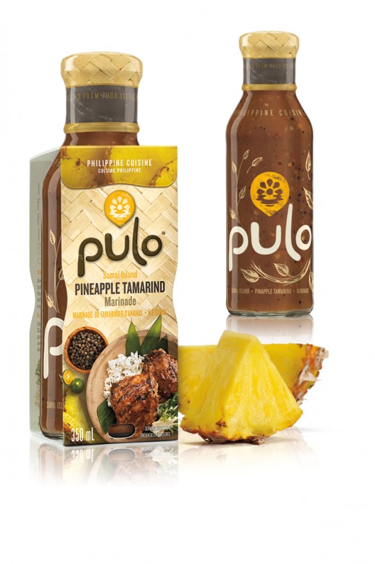
Pulo
“Designed by Dossier Creative | Country: Canada
Pulo is an authentic collection of cooking sauces and marinades inspired by the diverse cuisines of the Philippines. The name Pulo is a Philippine word for ‘island’ – the country comprises over 7000 islands – and was chosen as the brand name to represent the rich cultural mosaic found there. The packaging was designed to invite consumers to explore the country’s culinary delights and learn more about its vibrant heritage.

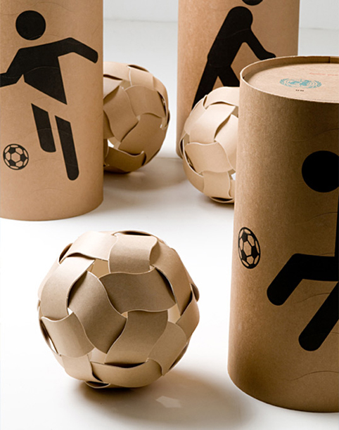
梦想足球 <wbr>Dream <wbr>Ball“To the children in The Third World; Tanzania, Rwanda, Burundi, Somalia, Congo and etc, who can’t enjoy football freely because of poverty, war and natural disaster, having a football means a lot and can be a dream and hope to escape from their poor life.However, the children are so poor that they can not buy a football. So, they play football with the ball made of plastic bag or coconut palm leaves, therefore giving them their own footballs which can give them hope. This is our aim for this project.
We suggest this Dream Ball made of relief boxes delivered to those poor children by recycling.
A. Create patterns that can help making a ball on the surface of an aid box.
B. Activities of giving aid boxes to children in The Third World.
C. The used aid boxes will be recycled as a football by children with the patterns on boxes.
D. By making Dream Ball with the children together, the aid organizations will get the chance to be friendly with them.”
“If children take off the paper from an aid box by following the patterns on it, and assemble those parts with the attached instruction, they can get a football. We can apply those patterns on any type of boxes - a square type, a cylinder type. Now,when children get a cyliner type aid box filled with supplies, they can move it by rolling that box.”
“In the aspect of material, we considered children playing football with bare foot. So,we use paper that can be recycled and its thickness changes the intensity and elasticity of the Dream Ball.”
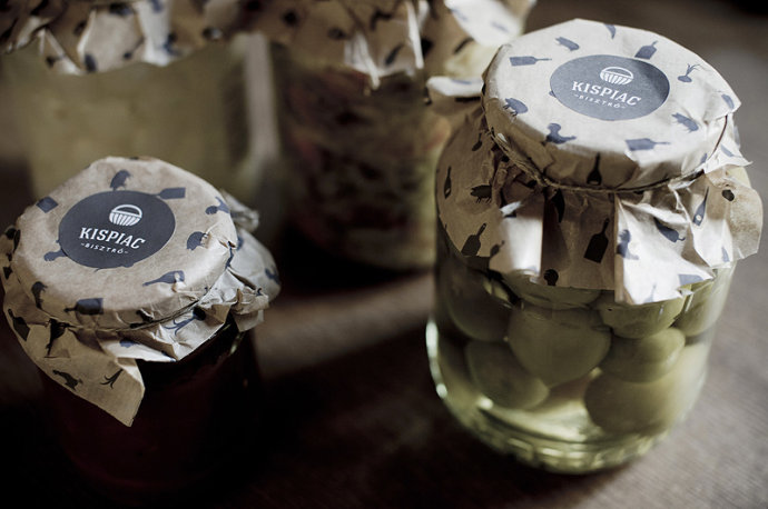
Kispiac
Designed by Eszter Laki | Country: Hungary
“Kispiac is a small, affable bistro nested just in the neighbourhood of one of the most famous markets of Budapest. Drop by for a nice coffee in the morning, taste the delicious grilled duck, chicken, pork with fresh salad or have a cold prosecco in the evening. The name “Kispiac” means “Small Market”, which refers to the market next door.”
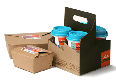
“As part of the Coca-Cola Co., Far Coast offers a premium selection freshly brewed coffees, teas and cocoas. Stores opened in Atlanta, Oslo, Singapore and Toronto. We designed the visual language and identity system for the new brand and its 17 blends. Additionally, we designed packaging, collateral, marketing materials and website.”
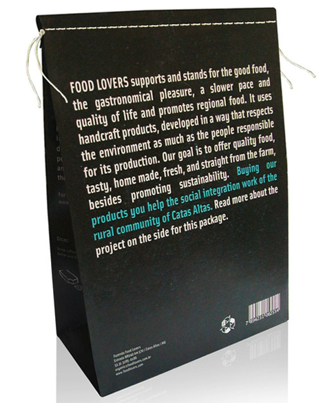
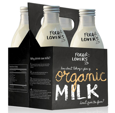
“The idea of this project is to promote a more healthy food consumption and, concurrently, to also promote sustainable local agriculture, which involves methods that do not harm the environment, respect workers and animals, provide fair wages to farmers and support farming communities.
Sustainability has a lot to do with buying food as locally as possible, so it is important that the package informs the benefits that buying locally grown can bring to the consumer and to the support of family farms and rural communities.
There are many other reasons why buying local food is both rewarding and delicious, including enjoying the taste of fresh food, improved health and nutrition and environmental stewardship. A person who appreciates food likes to feel all the senses that involves cooking, eating and serving it.
The sense of touch (when preparing a plate), sense of smell(when feeling the aroma), vision (when seeing an attractive plate, pleasant to the eye), sense of hearing (when hearing the sound of food being cooked) and finally sense of taste (when appreciating the taste of it). All this preparation involves patience, calm and no hurry. The whole process is an experience, which starts in the moment you go to the market to buy fresh ingredients to do your cooking.I have created a brand for a little market, that sells products of its own farm. Is called FOOD LOVERS. This brand is for people who appreciate tasty food, like to know where they came from, and care about all the elements involved in its production. The typography was created after a research on little markets, where the products are traditionally mentioned on a blackboard, in large separated letters written with a piece of chalk.
The idea of the hand in the brand come up because it is the greatest instrument that a person needs to do cooking. With the hand the sauce is tasted, the salt is sprinkled, the dough is kneaded, the quantity of oil is controlled, the limon is squeezed, the bread is sliced, and so on. The changing symbol shows the movement of the whole process of cooking. The hands interact with the typography of chalk, “tasting” and “preparing” it, as if it was fresh food, came right from the farm.
I have made a set of five packages and a fair bag. All the products has references of particular things that reminds old packages, regarding the idea that food used to be more natural and healthy than nowadays.
This elements are shown on all five packages: the cheese (packed with one sheet of craft paper wrapped up with a twine), the bottle of milk made with glass, the coffee packed with a twine, the traditional bag fair, and the little cone package of coffee, resembling packages that used to be sold in small quantities. All of the packages have a phrase inviting people to try this food, in a familiar and welcoming way.”
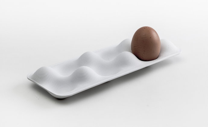
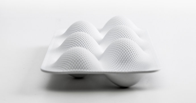
eggwave - 数字塑模鸡蛋包装盒
“eggwave”是一个放在冰箱里的鸡蛋包装盒。这个产品是werteloberfell与tobias schmidt合作为neff厨具公司设计的,
它将与neff公司生产的新型冰箱一起推出。eggwave共分两层,其中一层选用白色的塑料搭配点状的表面结构,另一层则是半透明的彩色塑料壳,它能够以三种位置嵌套在白色底盒上,分别可以盛装六个、八个或十个鸡蛋。这个设计旨在为那些成本仅几美分,用完就扔掉的日常生活用品设计一个极具雕塑感的形象和质感,进一步发展产品本身的功能性。
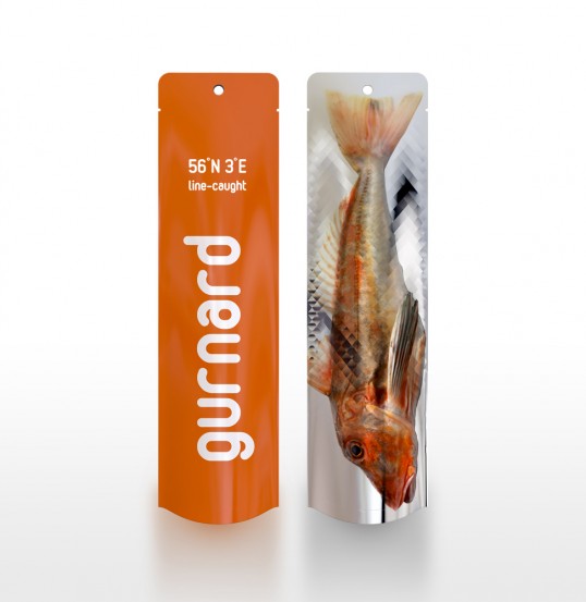
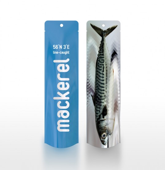
Fresh Fish Pack
“Supermarkets are expanding their fresh fish offerings to include more sustainable species like gurnard, mackerel and skate. These fish are cheaper and just as tasty, but customers often shy away from them because they are unfamiliar and occasionally just plain ugly.
This fish packaging proposal helps put these fish back on equal standing with their more recognized brethren by placing them in an attractive and highly recognizable packaging solution. The packages are intended for use at fresh fish counters. Constructed from a double layered polyethylene, they are airtight, resealable and can be filled with ice for transport to keep your fish fresh until it hits the pan!”
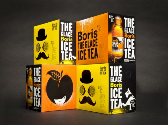
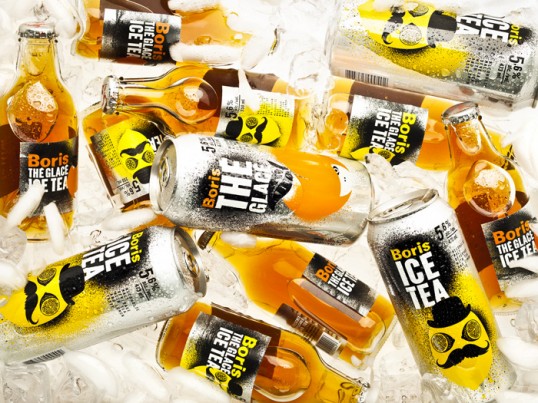
Boris Ice Tea
“Much to the delight of their growing fan base, Boris has introduced a new line of products to the market. As a pioneer in malt-based beverages, the Quebec company has been selling a refreshing selection of alcoholic iced teas since the beginning of summer. lg2boutique, the agency behind the Boris brand since the beginning, rolled up their collective sleeves and got down to the task of creating a memorable identity for this great new product.”
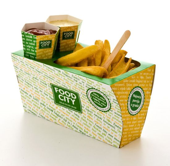
Designed by Istragrafika
这是一个非胶合折叠外卖餐盒包装解决方案系列。
理念:这个想法是建立一个外卖餐盒与模块化系统的帮助下夹式容器作为附件,
该系统的重点是从外卖盒转变为消费食品托盘。
目标:适应包装在快餐业的客户需求。根据客户意愿,模块化系统可满足大量
的组合,实现诸如转化为消费外卖食品托盘包装盒改造最大的可用性。
An innovative to-go packaging design out of cardboard that is not glued, and leakproof, and modular. Check it out below.
Designed by Istragrafika
"A family of packaging solutions for fast food, which includes a separate take&go“ french fries holders with sauce cups, as well as multifunctional takeaway meal boxes with added containers for salads and/or desserts. As mentioned, it is a non glued folding packaging, manually assembled with innovative patent witch does not allow leakage of fluid out of the box. And all this from the eco friendly cardboard with a minimum contribution of polyethylene coating for direct contact with food.
Idea: The idea was to create a modular system of takeaway meal boxes with the help of clip-on containers as attachments. Since the symmetric form of initial box, additional container can apply to both sides, depending on consumer wishes. The highlights of this system is transformation from takeaway box to a food tray for consumption.
Goal: Packaging adaptive to customer needs in fast food industry. Depending on the customer wishes, modular system meets a large number of combinations, achieving maximum usability of packaging such as takeaway box transformation into a food tray for consumption, and all this with style, where both are effective alternatives.
With the help of an intelligent set of perforation, customer becomes the packaging creator anywhere and any time."
设计源启动100年100位平面设计师系列
041. 胜井三雄 Mitsuo Katsui
胜井三雄1931年生,1955年毕业于东京大学教育学系。他涉猎所有平面设计领域,包括为1970年大阪国际博览会、1975年的冲绳海洋博览会以及1985年的筑波科学博览会担任艺术指导。JAGDA(日本平面设计师协会)创始人福田繁雄前不久去世,JAGDA(日本平面设计师协会)会长职务自此空缺,经理事会一致决定,推选资深设计师胜井三雄担任新一届会长。
-
-
042. 爱德华•麦克奈特•考弗 Edward Mcknight Kauffer
Edward (“Ted”) McKnight Kauffer was one of Europe's most prolific and influential advertising poster artists during the twenties and thirties, and as innovative as his more celebrated French counterpart, A.M. Cassandre.
-
-
043. 贡特尔•基泽 Gunther Kieser
1930年3月出生于德国的克伦堡,1951年毕业于奥芬巴赫工艺美术学院,毕业后在法兰克福作自由设计师,长期以来除了个人设计事务所的工作以外,以至在大学担任教学工作。在世界上许多国家博物馆举办过个人作品展,国际平面设计师协会会员。
-
-
044. 赫伯特•勒平 Herbert Leupin
Herbert Leupin besuchte von 1931 bis 1934 die Kunstgewerbeschule in Basel. Er erhielt ein Stipendium für einen Besuch der Ecole Paul Colin in Paris von 1935 bis 1936. Ab 1937 war Leupin als freischaffender Grafiker mit eigenem Atelier in Augst tätig. Im Jahr 1937 arbeitete Leupin für einige Zeit im Atelier von Donald Brun.
-
-
045. 苏珊娜•利奇科 Zuzana Licko
Licko was born in Bratislava, Czechoslovakia, and moved to the United States at the age of seven. Her father, a biomathematician, provided her with access to computers and the opportunity to design her first typeface, a Greek alphabet, for his personal use.
-
-
046. 埃尔•李西茨基 EL Lissitzky
El (Elizar or Lazar or Eliezer) Marcovich Lissitzky was a designer, typographer, artist, photographer, architect, and teacher (among other jobs). He had a great influence on the design work from the Bauhaus and De Stijl movements, and on modern commercial art and design. Here we present in full one of his great books, as well as other examples of his work in various media. In addition, we present art from other Suprematist painters, especially Kasimir Malevich
-
-
047. 雷蒙德•罗维 Raymond Loewy
雷蒙德•罗维生于1893年的巴黎,从小便对火车、汽车产生浓厚的兴趣,立志从事设计。他获得工程学学士学位之后,便应征入伍。一战结束后,于1919年移居美国。当时的他已近30岁,而且几乎双手空空,却以此为契机,开始诚心追逐童时的梦想。
-
-
048. 乔治•路易斯 George Lois
乔治•路易斯(George Lois)是美籍希腊裔广告人,最叛逆另类的艺术指导。是美国广告首席创意指导。是艺术指导名人堂(ART DIRECTOR HALL OF FAME)及创意名人堂(THE CREATIVE HALL OF FAME)的会员,身兼LOIS/GGK广告公司董事长及创意总监。
-
-
049. 查理斯•卢波 Charles Henri Honore Loupot
-
-
050. 赫伯•杜巴林 Herbert Lubalin
Herb Lubalin is known to have said that if he hadn't split an egg with his twin brother Irwin, he probably would have been George Lois. A small skinny kid with peculiar eating habits, he was warned by his mother he'd end up as a cockroach powder salesman if he didn't eat his lumpy oatmeal.
-
-
051. 阿尔温•卢斯蒂格 Alvin Lustig
Alvin Lustig’s contributions to the design of books and book jackets, magazines, interiors, and textiles as well as his teachings would have made him a credible candidate for the AIGA Lifetime Achievement award when he was alive. By the time he died at the age of 40 in 1955, he had already introduced principles of modern art to graphic design that have had a long-term influence on contemporary practice.
-
-
052. 卡西米尔.马列维奇Kasimir Malevich
Kazimir Malevich was born near Kiev in the Kiev Governorate of the Russian Empire. His parents, Seweryn and Ludwika Malewicz, were ethnic Poles,[1] and he was baptised in the Roman Catholic Church. His father managed a sugar factory. Kazimir was the first of 14 children, only nine of which survived into adulthood.
-
-
053. 哈维尔.马里斯卡尔Javier Mariscal
Javier Mariscal 1950年生于西班牙巴伦西亚。19岁时就在瓦伦西亚展出他的第一个漫画人物形象--El Senor del Caballito(小马先生)。 1971年他移居巴塞罗那,就读于艾丽萨瓦学校(Elisava School of Design)并创立了他的第一本漫画杂志-- Rrollo Enmascarodao。 70年代末期,他举办了几次艺术展从而开始了他的职业生涯,包括在Galeria Me Mec的El Gran Hotel(巴塞罗那,1977)。同期,他开始了在布艺、插图、家具和室内设计(Bar Duplex, Marieta, Trafico De Modas)的工作。并且出版了无数的杂志和书,例如Abcdari II.lustrat (巴塞罗那,1978). 它设计的作品Bar Cel Ona后来成为巴塞罗那市的市徽。 1989年创立Mariscal设计室,同年他设计的小狗COBI形象被1992年巴塞罗那奥运会选为吉祥物。同时举行了名为“Mariscal的100年”的个人展览。一艘作为展厅的破旧空船里展示了多种多样的Mariscal的作品...
-
-
054. 赫伯特.马特Herbert Matter
The growing archive of modern graphic design includes works by formidable practitioners who influenced styles, epitomized epochs and left indelible marks on common perception. Such imagery as Herbert Bayer's Bauhaus magazine cover, E. McKnight Kauffer's poster for the Daily Herald and Alexander Rodchenko's constructivist paperback covers are signposts of innovation.
-
-
055. 约翰.麦康奈尔John Mcconnell
-
-
056. 拉斯洛.莫霍伊纳吉Loszla Moholy-Nagy
László Moholy-Nagy also hear pronunciation: here, July 20, 1895 – November 24, 1946) was a Hungarian painter and photographer as well as professor in the Bauhaus school. He was highly influenced by constructivism and a strong advocate of the integration of technology and industry into the arts.
-
-
057. 布鲁诺.蒙高兹Bruno Monguzzi
平面设计师,字体设计家和大学教授,1941年出生于瑞士,1961年结束了在日内瓦和伦敦的学习,并在米兰的Antonto Boggen工作室开始了他的个人设计生涯,1965年他为加拿大蒙特利尔67世界博览会做了9个展厅的设计,1983年负责为巴黎新奥塞美术馆设计标志系统和整体形象,自1987年起,他以独立设计师的身份为卢加诺艺术博物馆工作一直到现在。
-
-
058. 斯坦利.莫里森Stanley Morison
Typographer, Editor, Historian of Printing, Designer of the Times New Roman Typeface.
-
-
059. 维克托.莫斯科索Victo Moscoso
Victor Moscoso (born 1936 in Oleiros, Spain) is an artist best known for producing psychedelic rock posters/advertisements and underground comix in San Francisco during the 1960s and '70s.
-
-
060. 阿方斯.穆哈Alphonse Mucha
The Mucha Trust owns the world's largest and most comprehensive collection of Alphonse Mucha's works. These include the famous lithographic works - posters and decorative panels - as well as less well known but equally important oil paintings, pastels, drawings, photographs, sculptures, books and jewellery. The Trust also owns all the intellectual property residual in Mucha's work.
-